
Graphs
Graphs
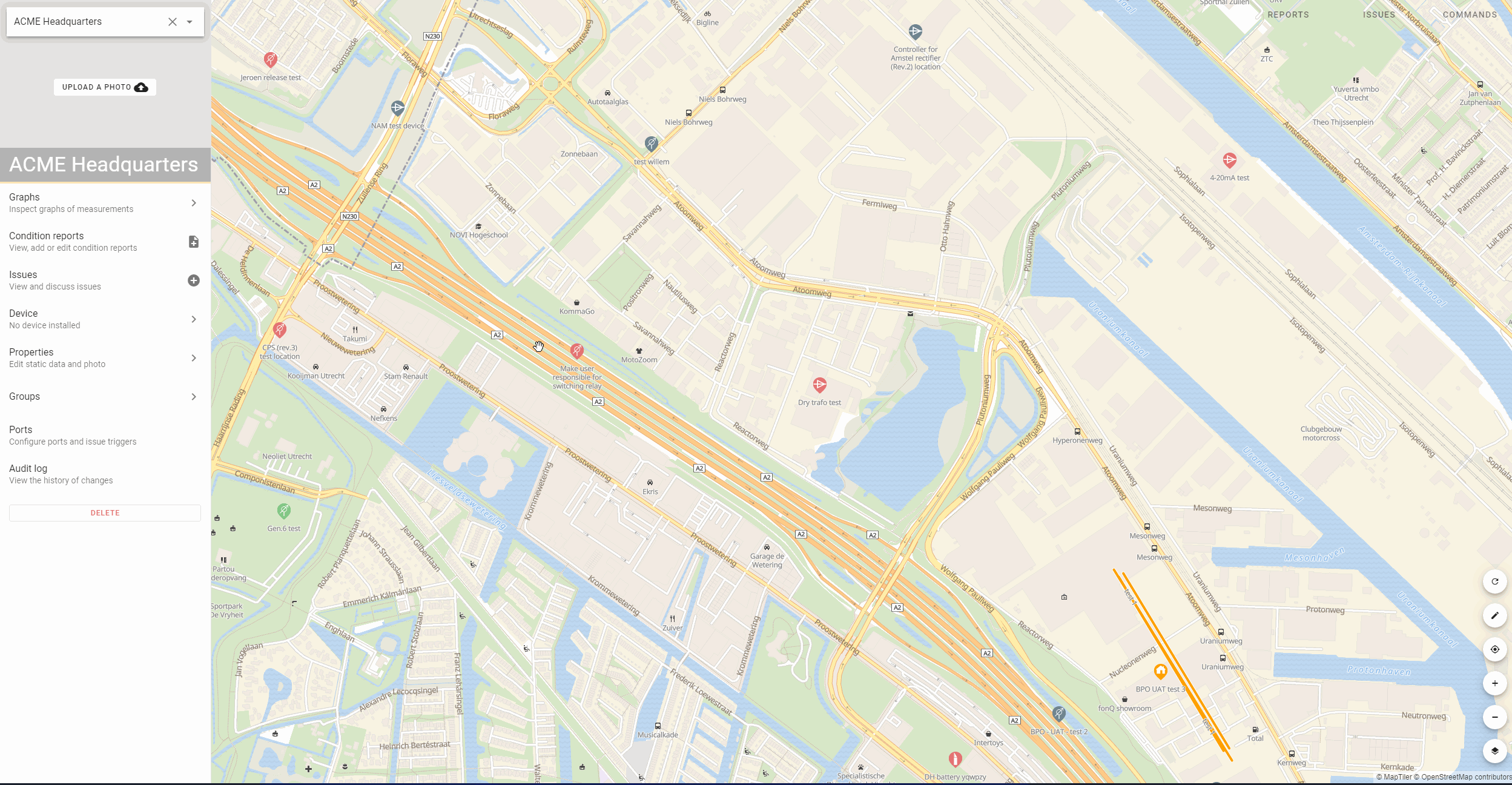
All measurement data from condition reports is shown in graphs on each location. For each port there is a separate tab for the graphs. For each location there is also a dashboard overview.
Thresholds
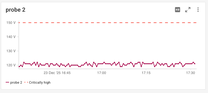
On a location level, it is possible to change the thresholds for each graph. Thresholds are visible when there is 1 quantity shown or when multiple quantities have the same thresholds.
Automatic dashboard
You can configure your own dashboard for each location or use automatic dashboard creation. This combines all the measurement data from the different ports. All the same quantities from different ports are added onto one single graph. You can override this functionality by creating manual dashboards. It is also possible to add measurement data from ports of different locations. A device supplier can also create a default dashboard configuration for the device. When switching from the automatic to manual dashboard, you can choose to copy the automatically generated graphs.
From this overview you can set issue triggers, enlarge one graph for a full screen view, rearrange graphs, rename graphs.
Automated names for graphs and time series labels
Automating names of graphs and times series labels helps make graphs specific for each location and port. This will improve the process of setting up your devices, locations and the analysis dashboards, allowing you to gain insight into the status of your assets more naturally, increasing effectiveness and further reducing the workload of your personnel.
The names of the graphs that are generated can be determined on the settings of the device in the connectivity environment.
If the name of a graph is left empty, automatic names will be generated for the graphs, which can be helpful, because port names and quantity names can automatically be shown. The same goes for the labels of the time series in the legend of the graph.
The automatic names are determined as follows (with priority given to higher rows on this table):
| Situation | Title of the graph | Label of the time series in the legend |
|---|---|---|
| The graph is shown on a port | Name of the quantity (Only in case the graph has just one time series) | Name of the quantity |
| All time series are from the same quantity | Name of the quantity | Name of the port (the name of the location will be added if the graph is on a dashboard from another location) |
| All time series are from the same port | Name of the port (the name of the location will be added if the graph is on a dashboard from another location) | Name of the quantity |
| Other cases | Untitled | Name of the quantity (the name of the location will be added if the graph is on a dashboard from another location) |
The difference between working with, and without the new feature is visualized below.
Exporting data
Location graphs can be exported as png or csv.
Graph rendering options
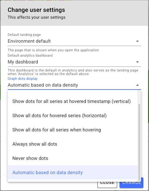
You can customize how data points (dots) are displayed on timeseries graphs through your environment settings. The following options are available:
- Hover single (default): Shows a dot only for the hovered data point
- Hover all (vertical): Shows dots for all series at the hovered timestamp
- Hover all (horizontal): Shows all dots for the hovered series
- Hover all: Shows all dots for all series when hovering
- Always: Always displays all data points
- Never: Never shows data points
- Auto: Let the graph automatically decide based on data density
This setting helps you visualize your data more effectively based on your preferences and the density of your measurements.
For example, the automatic mode when there are not too many data points to display: