

Analytics
Analytics
The analytics feature has been added, allowing dashboards to be designed according to personal wishes. You can create insight into (almost) any desired data cross-section through widgets. For example, a bar graph with the number of pipes per status (ok, serious, critical) or an overview groups with the most issues. It is a strong tool that gives users the power to improve monitoring of assets not only on the component level but more importantly on the system (population) level. The video below is an example.
Functionalities
Default analytics dashboard as default landing page
It is possible to choose your own custom dashboard from the analytics section as your main landing page when logging into the Asset Monitoring Platform. This way you have immediate overview into what’s important for you to monitor your assets.
In order to improve the fluidity with which you can navigate the application, we added the ability to set a default landing page for your environment (for environment administrators).
A single user of an environment can still override this setting with their personal preference.
Direct link
The analytics functionality also offers a direct link between the individual measurements, devices, locations and groups viewed in tables. This way, it is easy to navigate to location of interest.
Duplicate widgets
Duplicating widgets is possible with a single click of a button. This comes in handy when you want to use an existing widget as a starting point for a new one. Widgets can be also copied across different dashboards.
Download and exporting widgets
Bar charts, line charts and scatter plots can be easily downloaded as PNG. For all widget types, it is possible to export the search query into a csv file.
Watch the video on Youtube
Limit number of rows in table
The number of rows in the table defines how many points will be used in the visualization. The default setting of 30 rows can be easily adjusted up to a maximum of 100 rows.
Set limits for the y-axis of charts
To be able to interpret line-charts and bar charts more easily, users can now define custom values for the maximum and minimum value of the y-axis.
Visualization
The layout of the analytics dashboard panels can be easily customized by resizing or dragging individual widgets according to your own preference.
Tables
Tables are constructed from the source tables and are the starting point to creating any type of visualization. Therefore, the first step when creating a widget is to select a source table. A source table determines which columns you have available for your analysis. The following source options are currently available:
| Source table | Explanation |
|---|---|
| Locations | Includes devices and device type |
| Ports | Includes location, device and device type |
| Lines | With current condition |
| Port condition | Monthly statistics on issue triggers per port |
| Location condition | Monthly statistics on issue triggers per location |
| Line condition | Monthly statistics on issue triggers per line |
| Measurements | All historical measurements including linked static data |
| Reports | Includes locations, report types, devices, device types and users |
| Issues | Includes users, locations, devices, device types |
| Commands | Includes command types, devices, device types and users |
Each table can be constructed from a number of columns. The analytics feature allows the user to perform various operations on columns, such as aggregating, grouping, ordering, and adding custom restrictions for filtering.
- Adding multiple constraints to a single restriction is eventually the same as logical OR. This means, that at least one constraint should be true for a row to be included.
- Logical AND on a set constraint can be achieved by adding a new restriction for each constraint.
Result limitation
You can set a limitation on the number of rows per unique value of one or more columns. With this feature, you can, for example, show only the last two measurements per location.
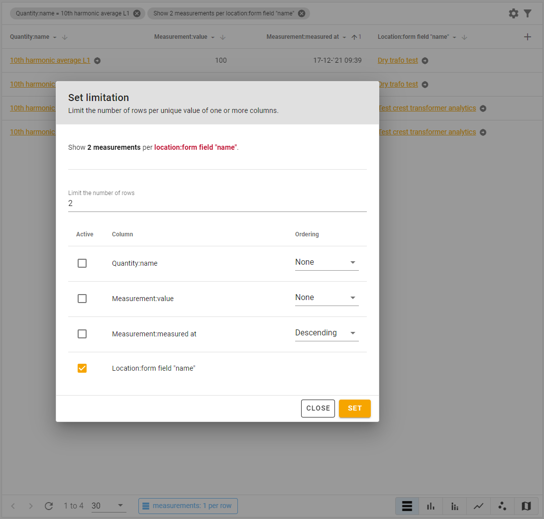
In the following tutorial, we explain step-by-step how to use the result limitation feature to limit the number of measurements per location.
Watch the video on Youtube
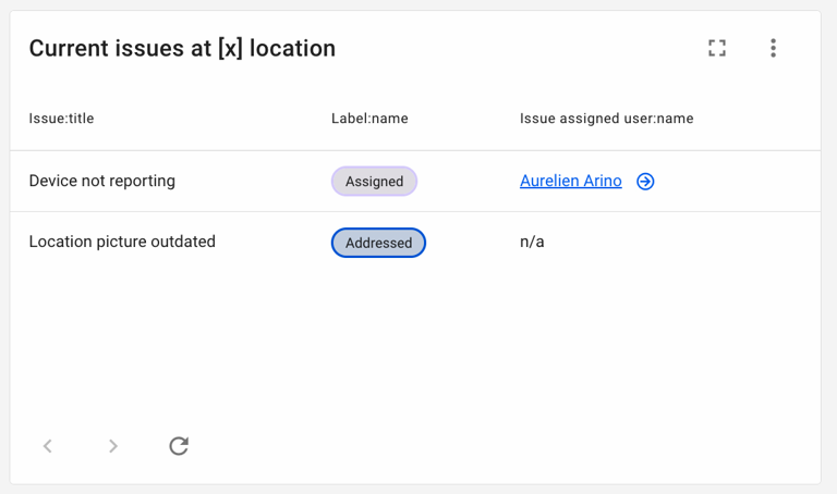
Issue labels
It is possible to use your issue labels in the analytics dashboards, either as a source, or a column.
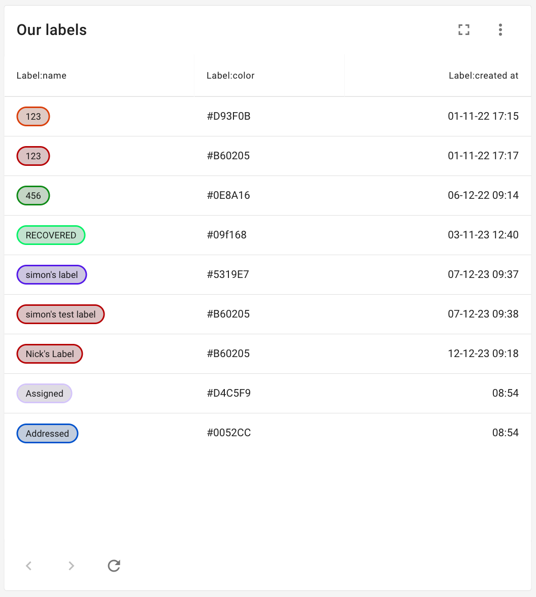
When labels are used as a source, no other tables can be used, but you can still use generic columns, for example calculation. This means it allows you to filter, sort or narrow your analytics widgets using the more refined labels that you are using to track your existing issues.
Bar charts
The platform offers two forms of bar charts: clustered and stacked bar charts.
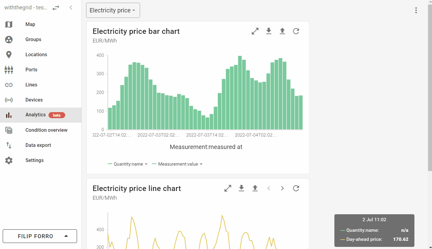
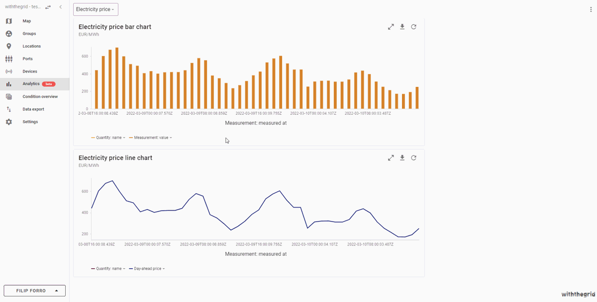
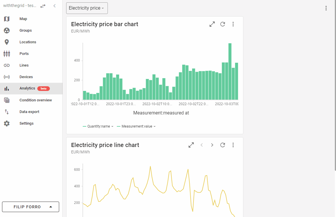
Line charts
The following example demonstrates how to create a line chart widget. In this example, day-ahead electricity prices from ENTSO-E are used as a measurement source for the widget.
Watch the video on Youtube
Scatter plots
Scatter plots can be used to visualize a collection of points placed using Cartesian coordinates.
Map widgets
Map widget gives users the power of analytics to create custom maps. This can help you improve the overview of assets of interest. In the following GIF, we demonstrate how you can filter for a single type of asset and create a map widget with a custom tooltip. You can also learn how to create a map widget by watching a video we made on map widgets.
Watch the video on Youtube
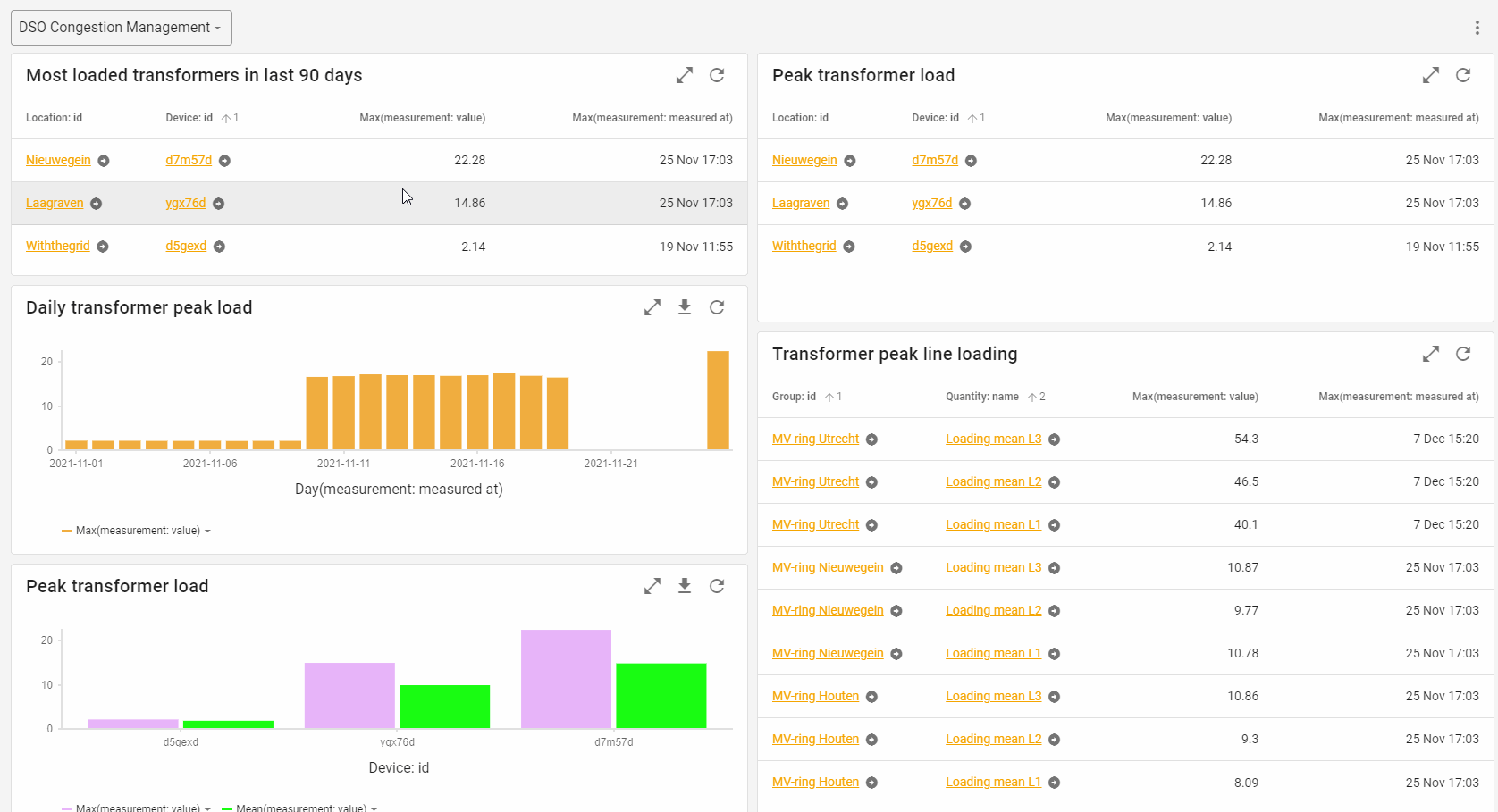
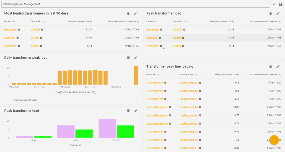
How-to-video
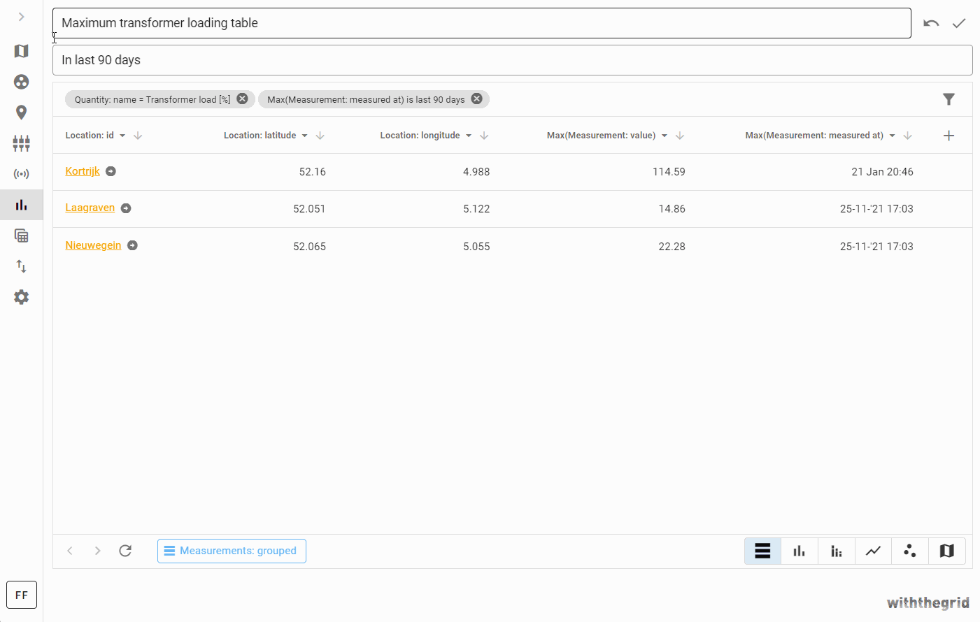
The following example will demonstrate how to create a simple widget to view a list of most loaded transformers in last 90 days.
Watch the video on Youtube